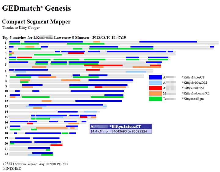
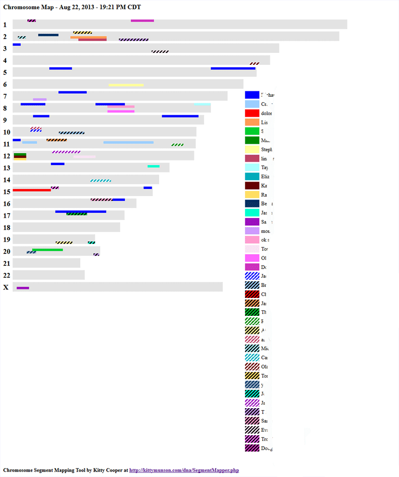
Today GEDmatch launched a version of my segment mapper which is integrated with their database. It can be used as a way to easily visualize multiple matches on GENESIS. This first version shows how everyone compares to the first person on the list, like the current 2D chromosome browser but more compact. Also each color is a person.
Above is the screenshot of my Munson cousins which even shows one of the boxes that appears when the cursor is placed on a segment. Click on this image to see a copy of the html version (edited for privacy) where you can put your cursor on any segment to see the details. (N.B. when you put your cursor on a segment and the information pops up via javascript that is called a mouse over in geek speak. )
One way to get a display like this at Genesis is to check the boxes (tier 1 only) next to your best matches in the one-to-many (up to 40 of them) and then click the button “Visualization” at the top of the page. Another way to get there is to use the Tier 1 tool “MultiKit Analysis” and select the kits you want to look at. Remember the first kit listed is the one that all the others will be compared to.


