One of my cousin’s kits that I manage has transitioned to the new 23andme. Here is the scoop. Most everything you do on the site seems to require that you go through a tutorial before you can participate and most everything seems to have been simplified.
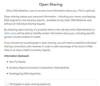
You do have to review your profile information and choose to opt into the Open Sharing the first time you log in. Open sharing lets your matches compare their DNA to yours to see if there are any matching segments without going through the introduction message process. This is recommended if you are doing 23andme for genealogy or adoption research.
The problem is that those of us who are deeply into using DNA for ancestry research will be disappointed by some of the loss of functionality on the new version of the site as well as by the fact that some functions are significantly clunkier for us.
The new main menu is greatly simplified, definitely an improvement. Instead of those fancy drop downs you have just four items; Home, Reports, Tools, and Research plus the little green icon with the number of messages you have listed. You have to click one of those to get to further menus.

HOME is the home page which seems far less useful than the old home page. It has a big graphic to encourage you to go to the research area and answer questions about yourself to help with their research. At the bottom of the home page are links to various tutorials.
REPORTS is where the new health information is as well as traits and ancestry. Happily the terrific ancestry composition by chromosome is still there. To get to it click Ancestry on the Reports page then click Scientific Details and either scroll down or click Your Genotype. Sadly there is no longer a drop down to see the ancestry of your shares. This is too bad as that was sometimes useful for helping to determine which line a match was on.
RESEARCH is where you answer health questions to help with their research.
The messages area seems to have inbox and outbox intermingled and is even less useful than the previous version. I recommend you keep your correspondance in a separate file on your computer and switch to regular email as soon as possible. I will check if the 23andme ++ chrome add-on handles this soon.
TOOLS has six areas:
- Share and Compare This is the new area for looking at what you share with one person
- DNA Relatives This is what I will discuss below, the new packaging of this functionality
Family Tree Lets you build a tree at MyHeritage as before - DNA Counseling Seems to have the ability to connect you with a counselor
- Forums This format has changed, tagging should make it easier to find posts of interest
- Raw Data Same functionality as before you can download or browse your data, prettier
Share and Compare
This might be a useful way to look at your close family’s shared traits and so forth. For example my Dad has more Neanderthal than my cousin. There is a place to indicate family relationships but I did not have any close family for my cousin to try that with so no report on this yet.
However the list of people you can compare to initially has only 10 people and they are listed alphabetically by first name. It took me five clicks on my cousin’s page to get to Lawrence, my Dad and my cousins has less than 100 shares. This was very annoying.
Manage Your Connections is listed on the share and compare page. Here you can add information about your close family and cancel outgoing invitations or add health sharing to your shares.
The new DNA relatives
This is the primary tool for the genetic genealogist. How has it changed? Well it is certainly simplified. Below is a screen shot. The dot to the right indicates the sharing level as shown in the drop down.
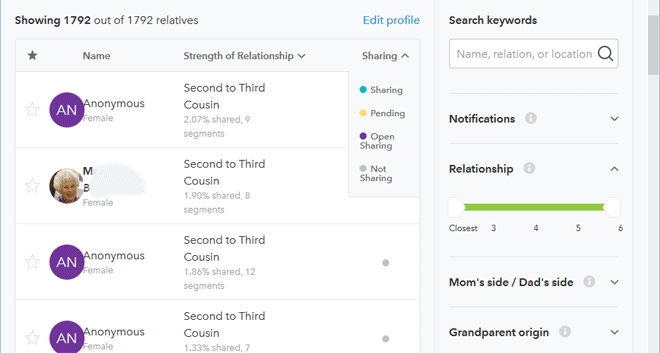
You can sort by Strength of relationship, Percent Shared, or Segments Shared. You can no longer sort by most recent or contact status. You can select to view just your shares, open shares (none yet), pending (not working yet), or not sharing. The not sharing just gets just anonymous matches on the first five load mores for my cousin. I wish there was an option not to see those anonymous matches.
The right hand column gives you more display options one of which is your grandparents’ origin and another is by surname. So I finally found a 3rd to 5th cousin to send a share to and discovered that there are only about 300 characters for messages. Once I sent the share, which did not require a message but I sent one anyway. I saw a nice summary of her ancestral places which included Etne Hordaland, the birthplace of my grandad and where my cousin still lives. Also it showed my potential share’s ancestry composition overview, her haplogroups, and her surnames. I hope I hear from her.
To find the DNA comparison capability you click on DNA listed at the top of the DNA relatives page. When you initially arrive at that page you are defaulted to PEOPLE which what was discussed above.
Comparing DNA has been simplified, you start with a bunch of icons and names on the left to select from, with your own profile coming first in the list. The rest are alphabetical by first name. The first person you select gets compared to the next group (up to five). WARNING, be sure to click the load more before adding names to the comparison as they all disappear if you load more afterwards.
You cannot type names to find people, you have to scroll down and find the relative. I am not looking forward to this on profiles with more shares.
The comparison page however is pretty nice, here is a partial screen shot:
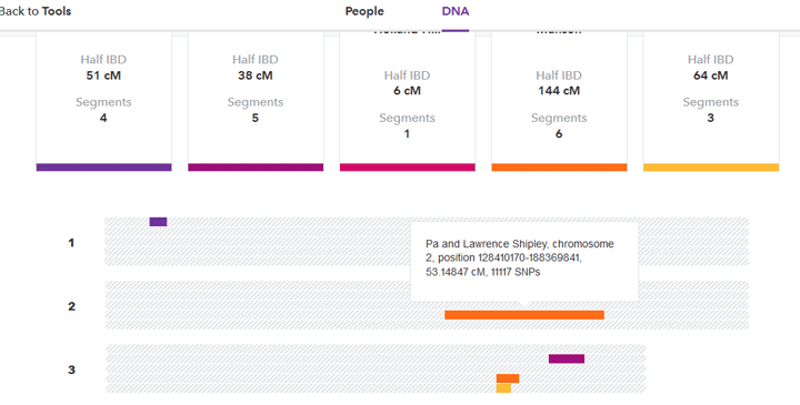
You can no longer get the table view to see the numbers for the segments where you match nor download a CSV file. If you place your mouse on a specific segment the numbers for that segment will appear in a little window. You can then cut and paste that to a text file from which you can either cut and paste each field to your master spreadsheet or if you have several of these you can make it suitable for import to a spreadsheet with a few small changes
So I had five lines like this
P and D, chromosome 3, position 161994639-175177252, 13.70976 cM, 2365 SNPs
which I massaged in a text editor to this
P and D,3,161994639,175177252,13.70976,2365
And then I saved that file with a CSV extension so I could import it to a spreadsheet. Then cut and pasted those lines over to my master sheet. I look forward to using the DNAgedcom client to get this data for me.
Profile pages are gone. If you try one of those URLs from your saved spreadsheets you will get a this is no longer supported message please go to the new 23andme
That’s all for tonight. Apologies for any typos. It is late and I am tired. More soon.
Addendum: In the new forums, Christine has promised that all our complaints above and in the comments below will be addressed so I advise patience to all and a happy thanksgiving.
Here is that URL:
https://www.23andmeforums.com/discussion/112/addressing-feedback-about-the-new-site#latest
I’m hard at work getting that automatted. Made good progress this past weekend, so hope to surprise people. 🙂
Thank you rob,
We are counting on you at DNAgedcom
Looking for the spreadsheet of all IBD Segments that we could get at FI:A before. It covered every share!
In the new “DNA View”, the “Family Inheritance: Advanced” functionality of being able to view or download the HIRs as a table has been removed, as has the ability to download a spreadsheet of all your matches. Apparently all that remains is the graphical interface, with no way to download the data (I think you’d have to copy it by hand for each person).
Also, I don’t know yet if “DNA View” will let you compare two different people who you share with (as FI:A does), or if you can only compare yourself to people you share with. (I just asked about this, so I’ll probably have a reply within a day.)
This is all from communicating with 23andMe Customer Support. My account hasn’t been transitioned yet, so I haven’t actually tried this out. This is just based on what they told me.
I have communicated to 23andMe how important it is to have this functionality. I hope others will convey this to them as well.
DNAgedcom will be the only way to get these and Rob is still working on it
Reading what Christine says in the new forums at https://www.23andmeforums.com/discussion/112/addressing-feedback-about-the-new-site#latest the download capability will come back eventually along with many other features missing at the moment, like finding specific individuals in the list and the sort DNAR by most recent.
How does the Y-DNA and mtDNA for the person tested and of the matches show up?
When you compare two people in share and compare, it will show you both person’s haplogroups among other fun facts
Thank you!! I was lost on this new site and am kicking myself for not doing an aggregated segment download before the switch.
Very helpful, Kitty. Having to scroll down, rather than being able to search on a name, plus not being able to sort on most recent or contact status are going to make our lives a lot more difficult – it seems as though 23andMe is purposefully trying to make it more difficult for anyone with interests other than health-related aspects.
I can’t believe that messaging is going to be even more cumbersome – if only we could sort messages by name (even first name), it would be SO much easier. Could you let us know if the URLs to messages are still working (I save these, but not the complete message, and am regretting not having yet saved all my thousands of messages).
Is there a replacement for Profile pages? If not, I’m going to have to try and grab useful things like GEDmatch numbers (when provided), before the switch.
Lastly, are Notes preserved on the new DNA Relatives list?
When you click on someone in your DNAR list you can see the profile information about them but in a different format from before. Plus now, even if you are not sharing, you can see where their grandparents were born, and of course their haplogroups.
I do not know about notes since this cousin did not have any
They will fix DNAR eventually see Christine’s post on the new site when logged in https://www.23andmeforums.com/discussion/112/addressing-feedback-about-the-new-site#latest
My Notes from the old system are still there after I was transitioned. It just took me a minute or two to find them.
Please let me know how and where you found my notes from the old system on the new system. Many Thanks…………
While experimenting with this new DNA compare format I tried to compare myself with a number of individuals. Seemed to work, OK, until I had to use the Load More feature to find the person I wanted to add to the comparison list….This wiped out those already selected……How can you compare someone from the first page of the list to someone on the second page?
While experimenting with this new DNA compare format I tried to compare myself with a number of individuals. Seemed to work, OK, until I had to use the Load More feature to find the person I wanted to add to the comparison list….This wiped out those already selected……How can you compare someone from the first page of the list to someone on the second page?
I guess I answered my own question…….You have to select the Load More function until all of your people are loaded onto the page, then go back and start the selection process of selecting yourself, then each of those you wish to compare to……..Doesn’t seem nearly as straight forward as the old method…..
By the way, you can still send shares to anonymous folk as long as they have not yet logged into the new site
How Kitty?
I can’t see any link to do anything other than see the match predicted relationship bits for the anonymous matches.
Does your comment apply only to those already transitioned looking at anonymous folk not yet logged in to the new site?
I’m not yet transitioned.
Only there if you have transitioned. Click on the anonymous icon
Looks like they care way more about their “health” stuff than they care about people who are using genetic genealogy. The disappearing profiles, the clunkyness of the chromosome browser, and the renaming of things for its own sake really makes me unhappy with this website.
I guess FTDNA vaults to the top of the list, even with all of its flaws. 23andMe was glad to have us while we made them look good for their IPO, now that they don’t need us anymore, they cast us adrift.
“Profile pages are gone. If you try one of those URLs from your saved spreadsheets you will get a this is no longer supported message please go to the new 23andme…”
Awful news.
I am beyond discouraged by what I have seen so far. Open Sharing sounds great, but they need to make it easier for people to find, and FIA is looking pretty DOA at the moment. Even if it’s prettier, the UI is more intimidating than that of FTDNA or Ancestry. I expect people may give it a try and then…give up. 23andMe seems to be turning its back on the genealogy market, perhaps having decided that we’re small potatoes compared to the $ to be made via big pharma and other medical alliances. Probably true, but disheartening anyway.
Dear friends, do not despair, our complaints will be addressed, see the URL in the forums that I just added to the end of this post.