One tool I use all the time at the DNApainter site is the online shared cM calculator. This shows you the possible relationships that you have to a DNA match based on either the shared centimorgans (cM) or the percentage of DNA shared. It uses both the calculated odds from the DNA geek and the observed odds from Blaine Bettinger’s shared cM project. I find that these are far more useful than the predictions at the various testing companies.
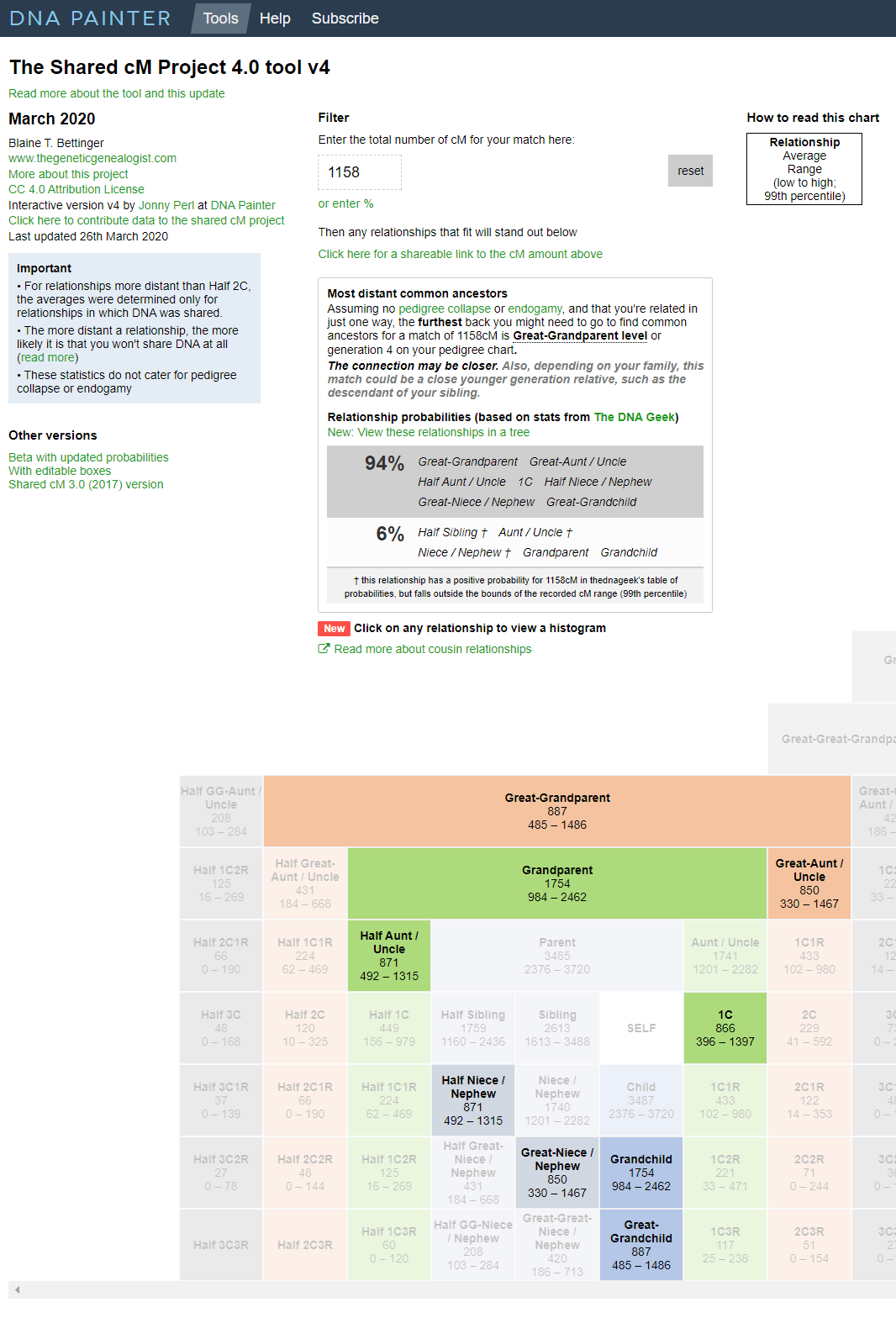
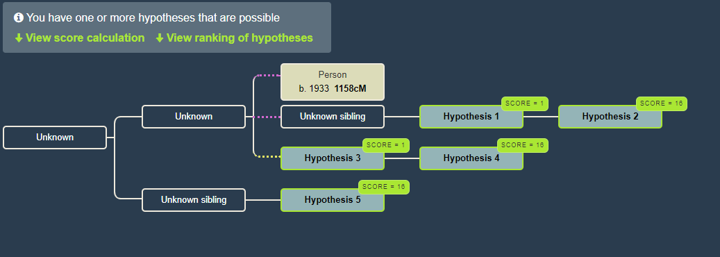
Results of the online calculator for cousin “C’ sharing 1158 cM, red arrow points to new feature
When you input a number in the box at the top under the word Filter, you get a display like the one above which shows the likelihood of various relationships. Additionally those possibilities have their boxes light up in the chart underneath (click the image for the larger version which shows that). I used the 1158 cM that my first cousin “C” shares with me, on the high end for that relationship, to see what would show.
Do you see my red arrow pointing to the new feature? When you click on the words View these relationships in a tree you get a diagram like the one below, showing possible places for you in the tree of your match. Quick tip, right click those words to get a little menu from your browser letting you open it in a new tab or window. This diagram is created by the WATO (What Are The Odds) tool.
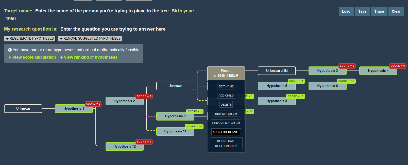
WATO for cousin “C” showing the menu for editing her in the tree (click for larger version)
One thing that takes getting used to for many of us genealogists, is that WATO uses a backwards pedigree format, a sideways descendant tree. The presumed common ancestor is on the left and the descendants fan out on the right. Every person in this diagram can be edited by the way. You can add names, birth years, whether they are half relationships, and so on.
Most people like visual displays of relationships so it is great to see the possibilities laid out in a family tree. Click the Continue Reading below for my experiments with some of my known cousins. However you may prefer to read about the details of this new tool by its author, Jonny Perl, on his blog (click here) – he does a great job of explaining it.
Also to learn more about WATO, click here for the Family History Fanatics youtube video or click here for Leah Larkin’s many more advanced articles on WATO.
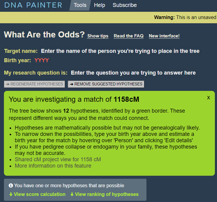
When I first clicked the new feature link and entered the WATO tool, I saw the screen above and entered my birth year. Needless to say I did not read it carefully enough so I had to retrace my steps to see how to put in the birth year for my match (click on their box in the tree to get a menu where you can edit that in). Once both our birth years were entered, the theories improved. Many of the boxes over the hypothesized people turned red and had a value of 0.
The red boxes indicate the relationships no longer possible
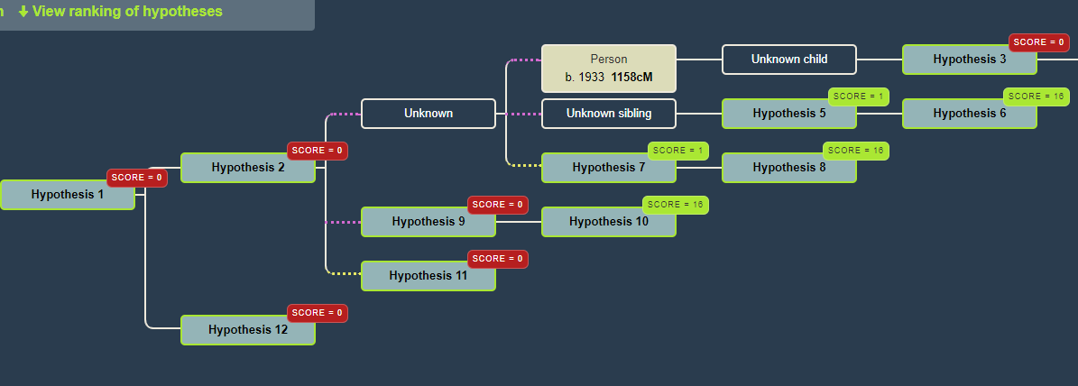
Next I realized I could get rid of the impossible theories in the tree by clicking the Regenerate Hypothesis button located under the words My Research Question Is above the diagram. Now the tree shows very clearly the likely relationships that make sense for our ages. Our most possible relationships are half niece, grand niece, or first cousin. Note that yellow dotted lines connecting boxes are used for half relationships while the purple dotted lines are full ones but from unknown to unknown.
The regenerated WATO with both our ages
The higher the number the more likely. At the bottom of the page the hypothesis are ranked. Note that my cousin “C” is from my grandad’s oldest brother and he was the youngest of five which gives us a big age spread. Here is what it says for me and my first cousin:
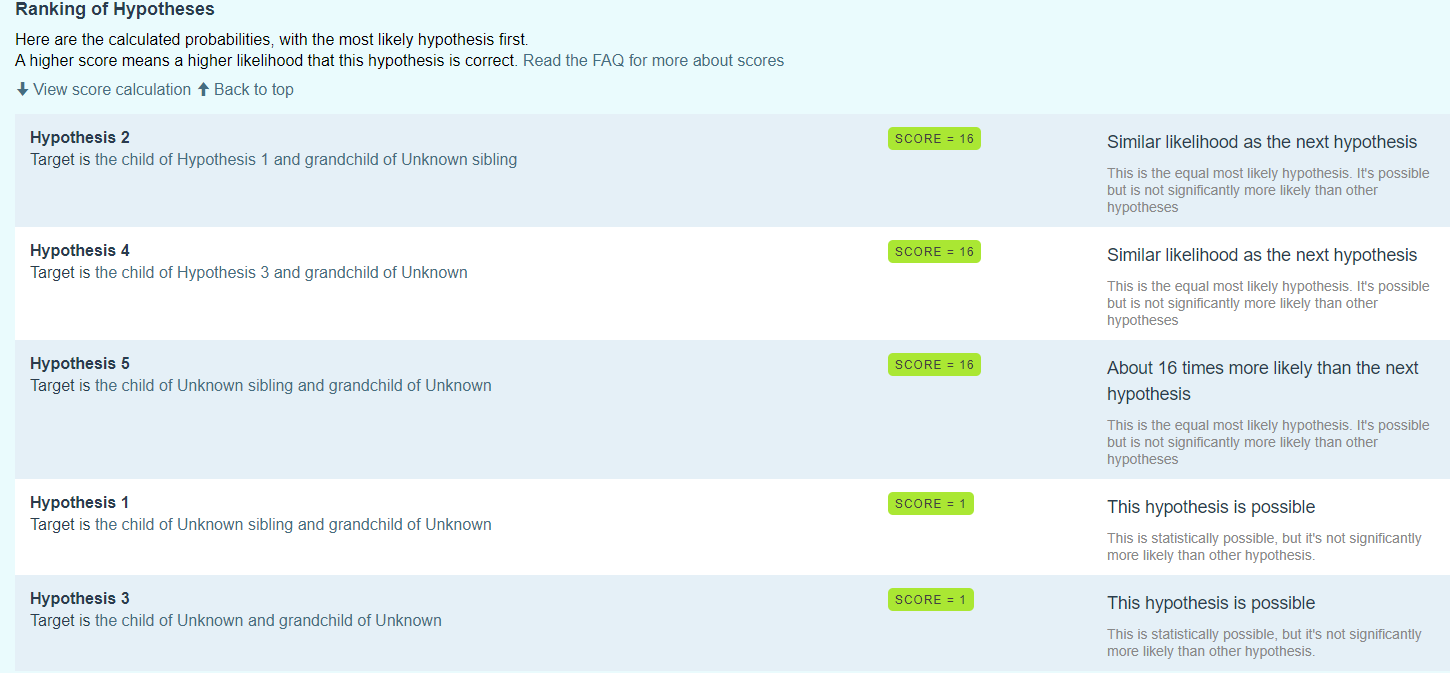
The ranked hypotheses. I know that number 5 is the correct one.
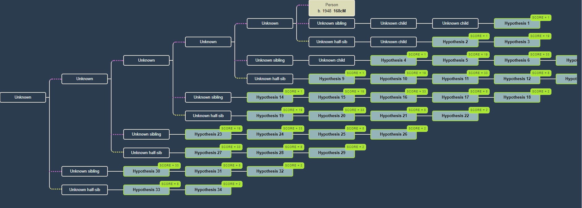
Now to try my second cousin who shares on the low end of the expected DNA with me. Many possibilities even after putting in the birth years. Note that the correct relationship is not the most likely. I did wonder if his grandmother was only a half sibling to my grandad, but he matches our 3rd cousins on both sides so that is not the case. Interestingly most of my first cousins are also low matches to him suggesting that perhaps our grandad just shared less DNA with his grandma or perhaps he just got less Munson DNA from his grandmother. The amounts he shares with my other first cousins are also on the low side: 255, 178, 153, and 133.
To summarize, this is a great way to look at the possible relationships with a new DNA match. Obviously the closer the match, the easier the chart will be to read. It also helps to know their approximate birth year. For people who work with unknown parentage, WATO is invaluable and this could really speed up their investigations.
This should be very useful Kitty. Thank you for sharing. I was gung ho on DNA Painter in 2019 and have not used it regularly since. I also struggle with WATO. Coincidentally, I was on the DNA Painter site today answering a question from a new DNA cousin.