Archive | 2013

It’s Pomegranate Season!

Having enjoyed eating pomegranate seeds in my salad at a friend’s birthday dinner, I thought I would try eating the ones growing in my backyard.

pomegraniteSmll 
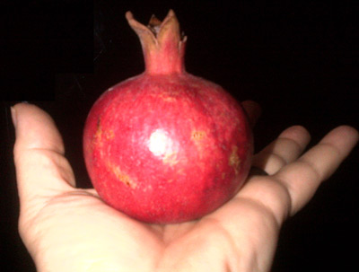
My first try colored my cutting board red and much of the floor as well. So I got on my computer and googled “seed a pomegranate without mess” to learn a better approach. Click the read more to see the two techniques I found. I confess that I have converted to the water technique which is amazingly easy.

The seeds are a crunchy, sweet, filling, and very healthful snack. A good source of vitamins K and C as well as potassium and all sorts of anti-oxidants. See this section of the wikipedia article for more in all that: http://en.wikipedia.org/wiki/Pomegranate#Nutrients_and_phytochemicals


Continue reading

Lakeside Garden Club

I recently volunteered to replace my garden club’s web site and asked members to send in photos.

Lakeside Garden Club

Slide Show page on the new Lakeside Garden Club site


Marilyn McFadden of McFadden Ranch sent in lots of wonderful professional shots with expert commentary specific to our part of Southern California, so I made many slideshows and used her plumeria photo as the site header. I am learning alot from doing this!

My Double 3rd cousin versus my brother and my Aunts as shown with my segment mapper

The results came in for my other maternal Aunt so now there are four of us to compare to my double third cousin and still no match on the X! In order to show the comparisons I used my new nifty chromosome segment mapping tool and also added in a bunch of known 5th and 7th cousins to the diagram.

Dbl3rdCOusin

Click on the diagram to go to the full size html page made from the segment mapper. Note that Shipley Munson is my brother.

Continue reading

Areas of faster and slower mutations in our chromosomes

A team of Penn State researchers has made a map of human chromosomes that shows the areas where mutations are more and less frequent; in their words “mutationally hot and cold regions.” However I found their diagram extremely difficult to understand. It took me quite a while to figure out the areas that are hot and cold for the SNPs that genetic genealogists are interested in. So I redid their image, removing the color for microsatellite repeat alterations, and changed the colors a little to be more in tune with hot and cold for me.

Here is my version:

HotColrAreas
Hottest
  Hot
  neutral
  Cold
  Coldest


Gray presumably are the areas not done and white outlined with black shows the centromeres. The one place with the least mutation is the X chromosome.


No guarantees that my reinterpretation of the graph by Kateryna Makova and Francesca Chiaromonte is correct!


Continue reading

First version of the DNA Segment Mapper is Released

So many people were trying to use my DNA chromosome mapper tool to look at a picture of their DNA relatives’ matching segments that I realized that another tool was needed to meet that demand. The first version of the new DNA segment mapping tool is ready. More information is at http://blog.kittycooper.com/tools/segment-mapper/

Sample Output from the DNA Segment Mapper

Sample Output from the DNA Segment Mapper


The DNA Segment mapper can show the matching DNA from up to 40 people in a chromosome style chart. Here is what my Dad’s top 40 matches look like (names are removed). The first two are first and third cousins once removed.

There is a page under tools above with more complete description and documentation.