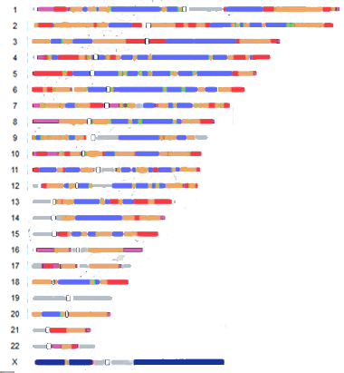
A team of Penn State researchers has made a map of human chromosomes that shows the areas where mutations are more and less frequent; in their words “mutationally hot and cold regions.” However I found their diagram extremely difficult to understand. It took me quite a while to figure out the areas that are hot and cold for the SNPs that genetic genealogists are interested in. So I redid their image, removing the color for microsatellite repeat alterations, and changed the colors a little to be more in tune with hot and cold for me.
Here is my version:
 |
Gray presumably are the areas not done and white outlined with black shows the centromeres. The one place with the least mutation is the X chromosome. |
No guarantees that my reinterpretation of the graph by Kateryna Makova and Francesca Chiaromonte is correct!
Continue reading