A while back I did a blog post explaining how to navigate the new 23andme (click here to read that). A number of my complaints in that post are now fixed. Most importantly, the ability to search for people to compare on the DNA Relatives > DNA page is there plus a table view which gives the numbers.
I cannot agree with the genetic genealogists who are abandoning 23andme due to the problems with its change over to their new web site, as well as the perceived lack of response to genetic genealogists. 23andme never made a secret of the fact that they are in this to research the genetics of various medical conditions. That is fine with me, as my extended family has many medical issues to look into, most, thankfully quite minor. They did make some nice tools for genealogists to attract more users into their database, but we have never been their primary concern.
While I do recommend Ancestry.com DNA testing for most new testers, many of my cousins want the medical information and so are willing to pay the extra for 23andme. It also has the best ancestry composition of the big three.
Personally though, my main reason for being patient and staying with 23andme is that I have found so many Norwegian and Norwegian-American cousins there (over 30) while only one or two at the other companies. Maybe we Scandinavians just have more genetic health issues. I also like the ability to compare cousins to each other and look at the ancestry composition by chromosome (although that is currently gone on the new site).
While 23andme is changing over to their new system, those of us with kits still on the old system have struggled to contact and share with our new matches. Initially we could not send shares to new matches so had to message them and ask them to send us a share. Thankfully that is fixed.
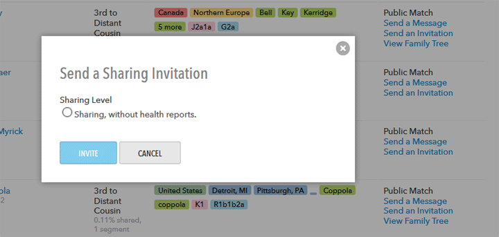
Now however there is the irritation that you have to check the circle that says “Sharing, without health reports” to get the blue send button to work when inviting a DNA relative to share.
I had been using the sort by most recent to check for new matches and had not seen any in several weeks. The other day I used the sort by contact status instead, which I usually use once a month, skipping to the end to see matches that are newly changed to public thus had not appeared in my view by most recent. Imagine my surprise when finding over a hundred of those! Something has changed … and some of these people I know I saw before, then they went anonymous, and now they are back?
I managed to invite about 30 a day for the past few days and have heard from five of them so far and had four shares. Only one who sent a message actually shared. Another was one already sharing who added her brother. More are coming in daily …
One problem is that users on the new system are not always figuring our how to accept the share! Soon I will have to do a basic tutorial on the new 23andme that includes how to accept a share


It seems to me the people who are complaining the most are very unhappy about the ability to post. They use the forums a lot. I am more interested in contacting my matches. I continue to contact and get acceptance to sharing with my matches.
I recently was direct to http://www.geni.com by a new shared “cousin”. I was given the link with my maternal grandfathers surname: klebba. I think there were about 130 of them! Wow!
You did mention finding the newest additions. While I receive emails about new additions, I have not been able to go to them directly with out going through my entire list. I must be missing something!
Willneu
Willy,
You can sort your DNA match list. In the new 23andme there is a pull down next to sort by above the people list in Tools > DNA relatives > People. Use the option “newest relatives”
In the old 23andme sort by “most recent first” to see new additions. This option is in the gray bar just above the match list. However it is also good to occasionally sort by “Contact Status” and then go to the end and work backwards looking for folk not yet invited. Contact status is not an option in the new 23andme.
mskitty,
Thanks for the comment. one thing that seems to be different is after viewing a new contact, is getting back to the same area of the list. Tried using my trackball mouse, the back arrow on the url line & at the top of the text. In one case I get sent back to the beginning or in the list of names but several pages previous page I just looked at a contact. Perhap this will get fixed at some point.
The new 23andme website is a mess. It’s a disaster on so many levels. It seems like it is multiple websites within one with duplicate and redundant pages, way too many things you have to click, and too much junk going on… there’s no rhyme or reason for the layout whatsoever. You sit there going, “Is this a tutorial page, or is it the real page?” “Where was the thing I just clicked?” “Didn’t I just see that on a different page? Where was it?” “Share again? I thought I already did?” “Why can’t I see the person I just shared with?” Share & Compare vs. Manage Connections vs. Family Tree vs. DNA Relatives vs. Manage Connections. Can anyone say “snafu?”
I did my kit in August 2014, and really enjoyed the site – it was easy to use. Then it underwent a redesign. Why?!!? Since this past December, I’ve had 3 separate relatives do the kit, and in every case, they’ve had to click at least 2 or 3 different pages ( !!! ) to enable sharing with me. You’d think the one “enable sharing with relative A” button would do the trick. Nope. There are other buttons hidden in other pages/areas. So far, mum’s clicked on 2 separate things to share with me, and nada. I’ve enabled sharing with her…. But it says I have 1700+ relatives that I share a whopping 0.24% with. I could go on about the pages freezing, the pages being too large to be useful… Found my mother’s name in a search, clicked on it, then it greyed out and then nothing. It’s like those freebie computer programs they used to give you in the 1990s – a lot of fluff and shiny colors, but not especially useful in the real world… like that bird you could program to talk. Sure, it was fun to make it swear, but that’s all it did, and it just was annoying after a while. So far my family has nearly $1,000 invested in the 23andme tests, and the return is negligible due to their ridiculous website. We’re a literate and computer savvy bunch: an engineer, a math genius, a financial wiz, and someone with 20+ years of genealogy research. And… we’re all good at puzzles. Can’t wait to see the mess when my son receives his results.
Sorry to grouse, I’m at the point where I’m embarrassed to have referred my family to use 23andme because it’s such a clunker.
Donna
Your complaints are all valid. It would seem they did not do much user testing before going live with this mess.
The tutorials are needed for the FDA but the having to click so many times is just poor design. I am doing fine mainly using Tools > DNA relatives > DNA (or people to send new invites)
Upload your family results to GEDmatch and DNA.land. The tools at GEDmatch are particularly good if a bit geeky. I have lots of articles here about gedmatch — http://blog.kittycooper.com/tag/gedmatch/
I agree with Donna. Looks like the old way/now hybrid is more user friendly than the new way. You have to keep reloading the list when adding people to compare, the list is semi alphabetical by first name (!) but not entirely (it is also a bit random) where it should have the option to list by relationship.
I keep hoping for change.
RG –
You can type names into the top search box when using using Tools > DNA relatives > DNA to compare people which is the main thing I use now.
The Tools > DNA relatives > People does have the different ways to sort which is useful when sending invitations
Yes it is clunkier than the old site but it is still the site with the most matches for my family
Kitty
Change can be a struggle and it sounds like there are some setbacks in usability. It also sounds like they’re making adjustments to be responsive.
Overall, they offer a wonderful service that the market needs and essential to me in identifying my family.
I think we feed 23andMe with suggestions and continue to support them.
You can see ancestry composition by chromosome on the new 23andme, though they do hide it pretty well. Go to Reports–>Ancestry Composition–>View Reports–>Scientific Details, and then scroll down the page a bit.
Thank you Christina!
Sadly I can only see my own composition though so comparisons based on ancestry are less useful for kits I do not manage.
The exact sequence is Reports–>Ancestry –>Ancestry Composition–>View Reports–>Scientific Details (at top of page in second line next to Summary), and then scroll down the page a bit.