Ancestry has been rolling out its clustering feature this past week to those of us with a Pro Tools subscription. If you have it, there is a new button at the top of your list of matches with an icon that says “By Cluster.”
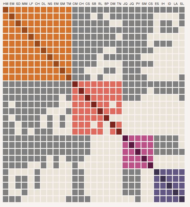
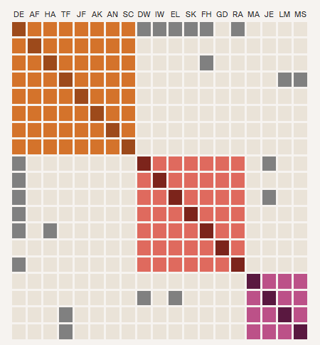
The purpose of clustering is to create an easy-to-use visual way of organizing DNA matches that are related to you and to each other. The graphic sorts the matches who share 65 cM to 1,300 cM with you into groups who also share at least 20 cM with each other. Each match is listed in the rows on the left as well as by initials at the top for each column. In a perfect world, you would get four colored boxes, like in the image below, where each box represents the line of one of your grandparents.
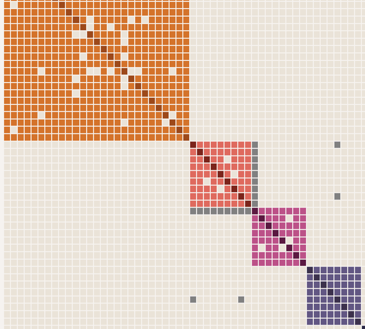
The image above has actually had the top box truncated and two additional boxes removed for illustration purposes. The left side would have the full name of the match while the top has just the initials.
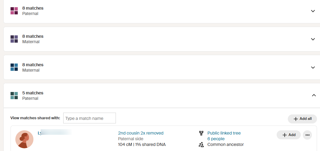
Below the diagram there is a list of the clusters. Click on any one to see the members of that group. Notice that each member has all the information you would see about that person in your match list. Another nice feature is that you can add everyone in a cluster to a colored dot group by clicking on the “+ Add All” button.
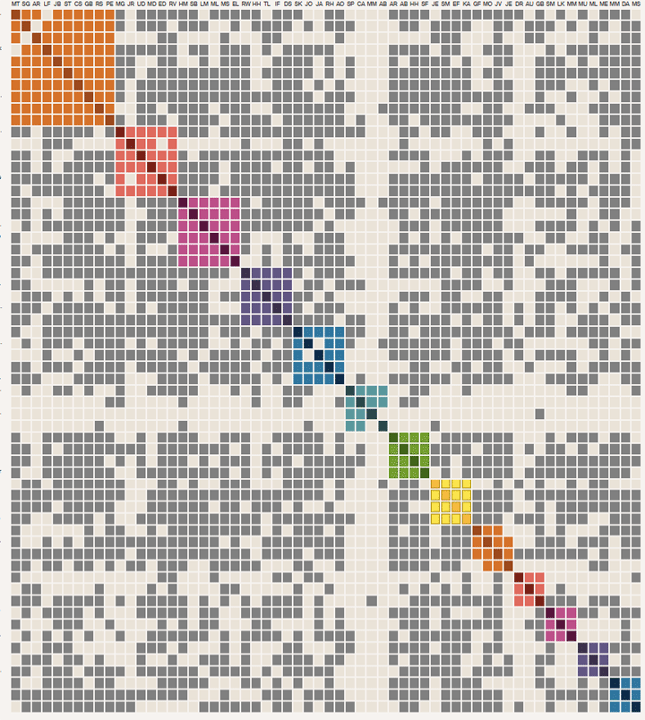
While this sounds like a wonderful new tool, for many of us it needs the ability to specify the range to include in order to get the best boxes. Below is what a Jewish friend of mine gets; lots of clear small boxes, but everyone is related to everyone else outside of the clusters, except for her middle box. This is what endogamy looks like!
And my own clusters only come up for my paternal Norwegian side and because so many of my first cousins and their children and grandchildren on that side have tested, everyone really is related to everyone. Same problem with my brother’s clusters. Not useful without the ability to change the range of numbers included. That is coming soon as there is a “Custom” button which is currently grayed out. For me, I just want to group my second and third cousins or maybe even just the group in the “extended family” bin.
My own clusters are only for my paternal Norwegian side
A strange problem occurs when I look at my late jewish husband’s clusters, he only gets one small one. Although his parents came here in the 1940s, he still has many American maternal side relatives. It would seem that his huge Tieger family (14 in that group that fall in the correct range) is not included for reasons I do not understand. I checked his second cousin once removed and she has a nice group of three clusters, the middle one includes seven of those Tiegers. I need to follow up on this with support.
Then there are the people who have so few matches that they get the message “We’re sorry, we couldn’t cluster your matches.” Plus those with so many matches that they do not get the visual clusters, although they get the groupings below the message “Chart view is available for clusters of 100 matches or fewer.” I am fortunate to have helped so many people over the years that I get to look at many of these diagrams.
Both MyHeritage and GEDmatch have had clustering tools for a long time and they both allow the changing of cM parameters for the groupings. Click here for my 2019 article about clustering on those sites.
However the Ancestry implementation has the benefit of a much larger database. They also use good strong colors and have an attractive presentation. I look forward to when it includes the ability to customize the range!
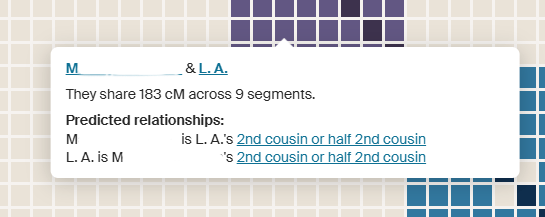
Thanks, Kitty. The Clusters I got were 100% correct, including a few Matches that still have no genealogy info, but whom I had manually clustered years ago. So, like MyHeritage and GEDmatch, the Clusters at the high cM level almost never provide new info. I am anxiously awaiting the ability to adjust the cM range, which will allow me to use my Walk The Clusters Back process by lowering the upper and lower cMs to target tighter, more distant Clusters – out to 4C, 5C, 6C, etc.
Jim, You indicated in your Walk Back the Clusters 2022 blog “I’m confident this process will tell us some Root Ancestors for all of our Matches down to 20cM. Just think what we could do with those clues…” Do you think Ancestry might at some point similarly give us the capability to cluster our 20cM matches?
May I ask an unrelated question? On my X chromo 23, will I also have matches from my father’s side, and this from the X he gets from his mother?
Caith, the answer is yes, perhaps read this article http://blog.kittycooper.com/2014/01/what-does-shared-x-dna-really-mean/
Interesting to see with other AJ background as a couple of people had error messages saying that they couldn’t generate any because too few matches when that wasn’t the case.
In my case as well as for my relatives, it said:
Many of your matches have a high amount of shared DNA, even though they aren’t related. That makes it hard to find clusters relevant to recent ancestors.
This is common among groups of people who were historically isolated due to geographic barriers, like mountains or bodies of water, or for cultural reasons, like language or religion.
————-
I did see this last night for someone of French Canadian background, same exact message.
Yes, I think it is still a bit buggy for the less ordinary groups of matches. I did report the problem with my late husband’s clusters to support.
All French Canadians seem to be getting this response. I manage many accounts and anyone with FC heritage on one parental side seems to over cluster lol
I signed up for Protools a few weeks ago. I am not seeing “By Cluster” as an option on my match list. Is it rolling our slowly? It may not matter anyway. As I am Ashkenazi, clustering at other sites has turned out to be pretty useless.
They are rolling it out slowly. You will probably need the ability to change the parameters to get anything useful…
I was excited to try this, but I get the “we’re sorry” message for not enough matches. I have 725 matches, only 1 of whom shares over 65 cM with me. I’ll try putting my Ancestry match info into Genetic Affairs and see what that looks like
I have two accounts that have many close matches and not so close matches, but they will not cluster. One is Jewish and the other has parents who were first cousins once removed. So this might be used as another clue that the parents were very closely related?
Pingback: Friday’s Family History Finds | Empty Branches on the Family Tree
Pingback: This week's crème de la crème - July 12, 2025 - Genealogy à la carteGenealogy à la carte
Wow, not worth the price for me – Out of 4500 matches that Ancestry calls close, only 60 are >65. And while I don’t personally know ALL those people I already know what cluster they will be in from shared matches. What I need, as someone with 85000 matches, many of whom share DNA with known folks in disparate great grandparents’ lines, is for the clustering to work on the 4th cousins – the 20-65 lot. Realize that may not be everyone’s situation, but I appreciate finding that out. Saves me trying the pro tools.
I wish I had access, and I have ProTools. The one on My Heritage has 14+ clusters, but my match pool is much smaller than Ancestry….