Ancestry has been rolling out its clustering feature this past week to those of us with a Pro Tools subscription. If you have it, there is a new button at the top of your list of matches with an icon that says “By Cluster.”
The purpose of clustering is to create an easy-to-use visual way of organizing DNA matches that are related to you and to each other. The graphic sorts the matches who share 65 cM to 1,300 cM with you into groups who also share at least 20 cM with each other. Each match is listed in the rows on the left as well as by initials at the top for each column. In a perfect world, you would get four colored boxes, like in the image below, where each box represents the line of one of your grandparents.
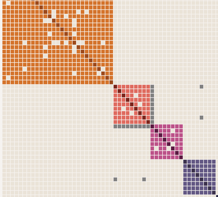
The image above has actually had the top box truncated and two additional boxes removed for illustration purposes. The left side would have the full name of the match while the top has just the initials.
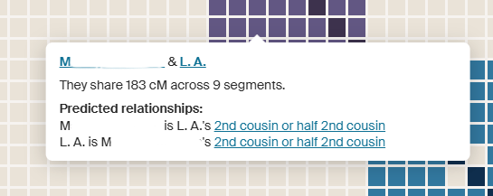
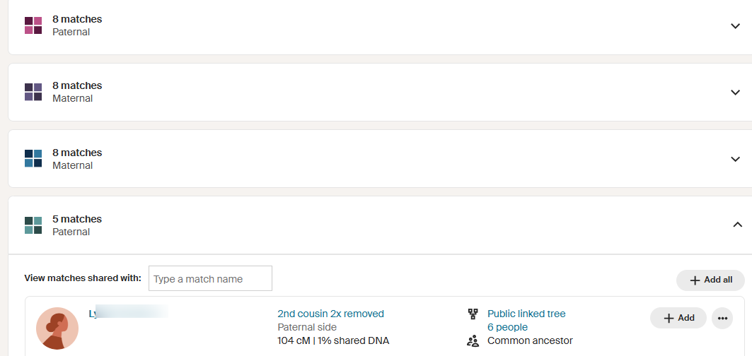
Below the diagram there is a list of the clusters. Click on any one to see the members of that group. Notice that each member has all the information you would see about that person in your match list. Another nice feature is that you can add everyone in a cluster to a colored dot group by clicking on the “+ Add All” button.
While this sounds like a wonderful new tool, for many of us it needs the ability to specify the range to include in order to get the best boxes. Below is what a Jewish friend of mine gets; lots of clear small boxes, but everyone is related to everyone else outside of the clusters, except for her middle box. This is what endogamy looks like!